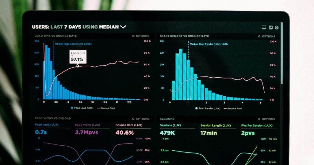

The speedometer that’s been recalibrated without telling you
Open rate used to be the headline number in email marketing, and it’s easy to see why: it felt like a direct read on curiosity. Someone saw your subject line, and they clicked. Simple.
Then privacy protections arrived. Apple’s Mail Privacy Protection routes messages through a proxy server that preloads the email — images and tracking pixel included — the moment it lands, whether or not a human ever looks at it. That preload registers as an open. Multiply that across a list where a meaningful share of recipients use Apple Mail, and your open rate is now measuring server behavior as much as human behavior. Gmail and Yahoo also cache images in ways that limit visibility into genuine engagement, so this isn’t a story about one company breaking one number for everyone equally — it’s a broader shift in how much a sender can actually see.
The honest response isn’t to throw the metric out. It’s to stop reading it as a precise measurement and start reading it as a rough trend line. If your open rate has been sliding for three straight months, something real is probably happening — fatigue, a cooling list, a subject-line rut. The absolute number, though, tells you far less than it used to, and treating "45% open rate" as proof that nearly half your list is genuinely reading your emails is no longer a safe assumption.
Why a click is worth more than an open
Here’s the useful flip side: nobody clicks a link by accident, and no privacy feature clicks on someone’s behalf. A click requires a decision. That single fact makes click rate the most trustworthy behavioral signal left on most dashboards.
It helps to look at two versions of it together, not separately. Click rate (clicks divided by everything delivered) tells you how the whole campaign performed. Click-to-open rate (clicks divided by opens) tells you how the content performed among people who plausibly saw it. Reading them side by side turns into a rough diagnosis: a low click rate paired with a healthy click-to-open rate suggests your content is fine but your subject line isn’t earning attention. A high open rate paired with a weak click-to-open rate suggests the opposite — the subject line oversold what the email delivered. Neither pairing proves the cause with certainty; a slow week, a seasonal dip, or a segment quirk can move these numbers too. But as a diagnostic starting point, it beats staring at open rate alone.
What each number is actually good for
Laid out side by side, the dashboard stops looking like noise and starts looking like a set of distinct questions, each with a different reliability level.
| Metric | What it tells you | How much to trust it |
|---|---|---|
| Open rate | Rough attention trend over time | Low precision; watch direction, not the number |
| Click rate | Whether people took a deliberate action | High — clicks aren’t automated |
| Click-to-open rate | Whether content matched the promise of the subject line | Useful only paired with open rate, not alone |
| Revenue per email | Whether sending is worth the effort, in real terms | High — directly tied to business outcome |
| Bounce rate | List hygiene and deliverability risk | High; a rising trend is a real warning |
| Unsubscribe rate | Whether the list is self-cleaning or something specific went wrong | Trickle is healthy; spikes need investigation |
| Spam complaints | Damage to sender reputation | High — even small rises matter |
The pattern: metrics that require a deliberate human action (clicks, unsubscribes, spam reports) or that tie directly to money (revenue per email) hold up. Metrics based on passive loading (opens) don’t hold up the way they used to.
Revenue per email: the number that reorders your assumptions
Engagement is nice to look at, but it isn’t a business outcome. Revenue per email — money attributed to a send, divided by emails delivered — is the metric that forces a reckoning: the campaign you were proud of might have sold nothing, while a plain product update quietly did the real work.
It’s worth checking two related things monthly, without over-indexing on any single benchmark. First, what share of total revenue is email driving? Reported figures vary widely by source and by business type — one widely cited ecommerce cohort average sits around 27%, though the same data shows a roughly five-times spread between brands with mature automated flows and brands running campaigns alone, and the realistic range shifts by vertical, from higher for repeat-purchase categories like beauty or food to lower for infrequent, high-ticket purchases like electronics. A separate benchmark view puts the broader healthy band for owned email and SMS revenue somewhere between 20% and 40% of total revenue, with under 15% usually pointing to missing automation rather than a ceiling on the channel itself. Treat these as reference points to sanity-check your own trend over time, not as a pass/fail grade — your list size, purchase frequency, and category all shift what "good" looks like for you.
Second, look at the split between one-off campaigns and automated flows. Triggered sequences — welcome emails, abandoned-cart follow-ups, post-purchase messages — tend to outperform manual blasts by a wide margin because they arrive at a moment that’s already relevant to the recipient’s behavior, not on the sender’s schedule. If nearly all your email revenue comes from campaigns and almost none from flows, that imbalance is itself a to-do list.
The smoke detectors
Three metrics you’ll mostly ignore, and be glad you tracked in the weeks they matter.
Bounce rate flags addresses that no longer exist; a rising trend signals list hygiene slipping in a way inbox providers notice. Unsubscribe rate is the most misread number on the page — a small, steady trickle isn’t failure, it’s the list removing people who were never going to engage, which protects deliverability for everyone left. A sudden spike, though, on one specific send is worth investigating, because it’s telling you something concrete about that message. Spam complaints deserve the most respect of the three: even a small rise can damage whether any of your future emails reach an inbox at all, and it usually traces back to sending too often, being irrelevant, or making the unsubscribe link hard to find.
Turning the dashboard into a decision
The failure mode of most metrics advice is stopping at "monitor these." Monitoring doesn’t change anything — deciding does. A workable monthly ritual is short: check the trend, name the signal, guess the likely cause, change one thing, then measure again before touching anything else.
flowchart TD
 A[Check monthly trend] --> B[Identify the standout signal]
 B --> C[Infer likely cause]
 C --> D[Change one thing]
 D --> E[Re-measure next month]
Notice the discipline built into that loop: one change, not five. Rewrite the underperforming flow. Borrow your best campaign’s subject-line style for the next three sends. Reduce frequency to the segment unsubscribing fastest. None of these moves is guaranteed to work for your specific list — no single metric here proves product-market fit, and no benchmark applies uniformly across every business. What the loop gives you instead is a disciplined way to test one assumption at a time and actually learn from the result.
The takeaway
Open rate isn’t worthless, but it’s stopped being a scorecard — it’s a trend line, and a fuzzy one. Clicks tell you the truth about attention because they require intent. Revenue per email tells you what any of it is actually worth. Bounces, unsubscribes, and spam complaints are the alarms you check rarely and trust completely when they go off. Put those four at the center of your review, let open rate ride along as background context, and your dashboard stops being something you glance at and starts being something you argue with — one change at a time.